Frost Iluminous Fest
- ClientIluminous
- Year2018
- RoleEvent identity, key visuals, ads
- ToolsPhotoshop · Illustrator
An identity for a festival of light. Black, white and a single beam: a system bright enough to stand out at night and simple enough to work at any size.
Identity
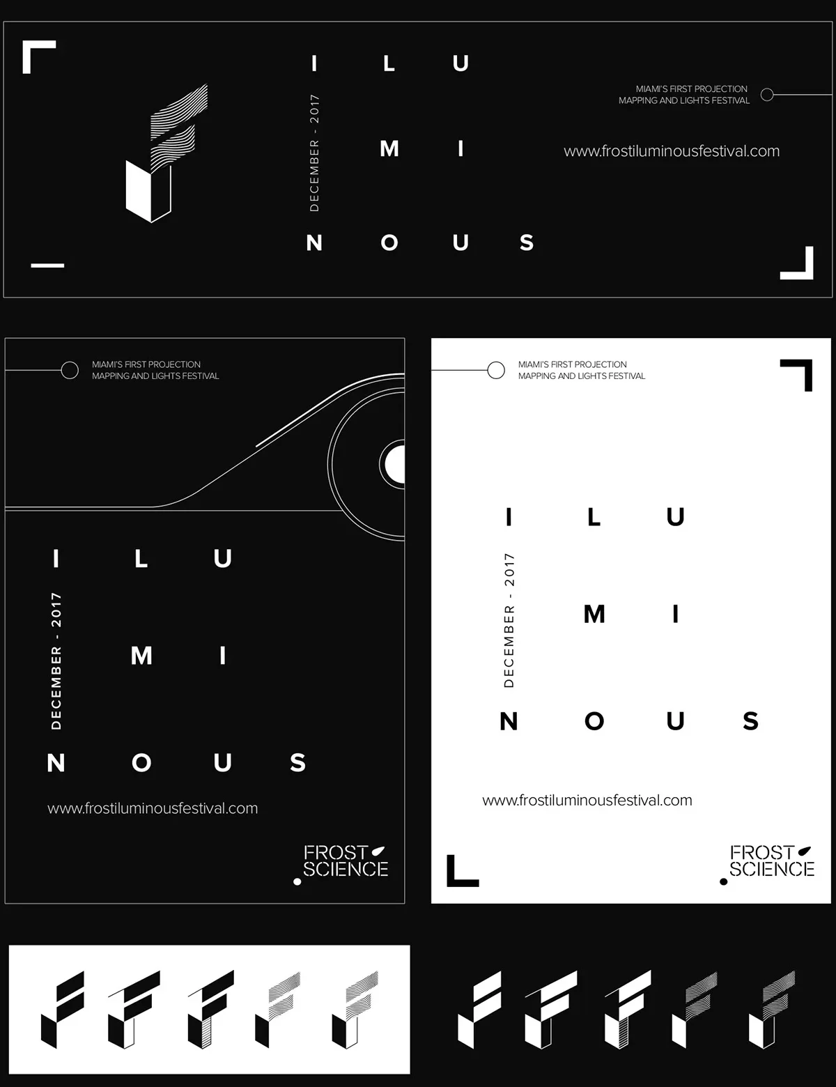
The logo pairs a clean, widely spaced wordmark with a small symbol of rays breaking through.
The palette stays almost entirely in black and white, so the light itself becomes the color.
Campaign
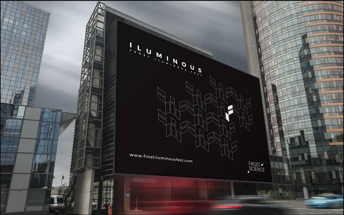
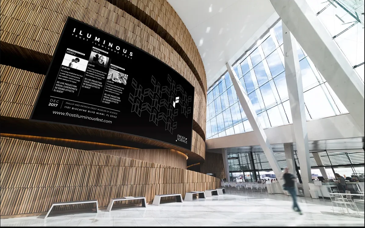
The key visual was adapted to large-format placements (station screens, street billboards and bus shelters) and to mobile.
The layout stays the same everywhere, so the festival is recognizable at a glance.
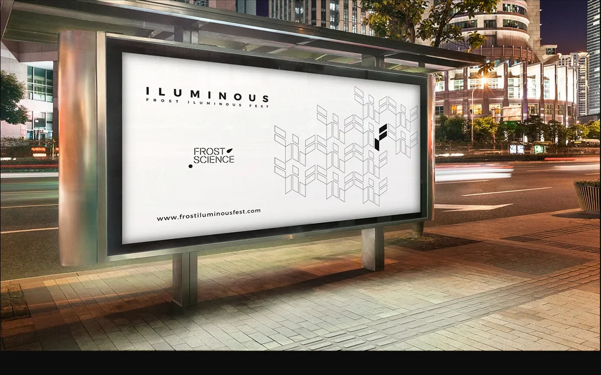
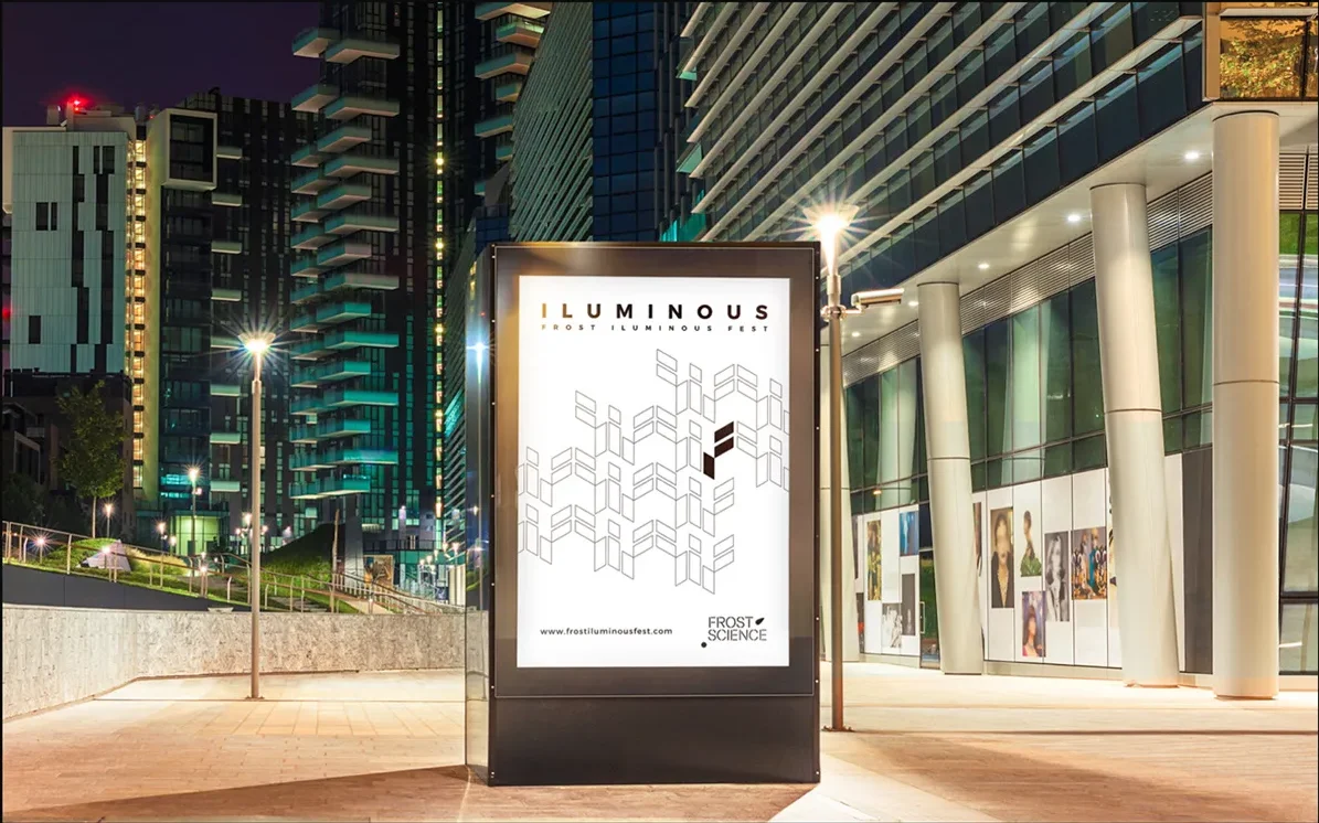
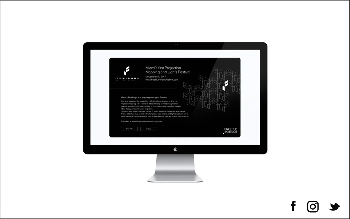
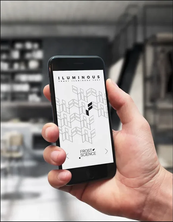
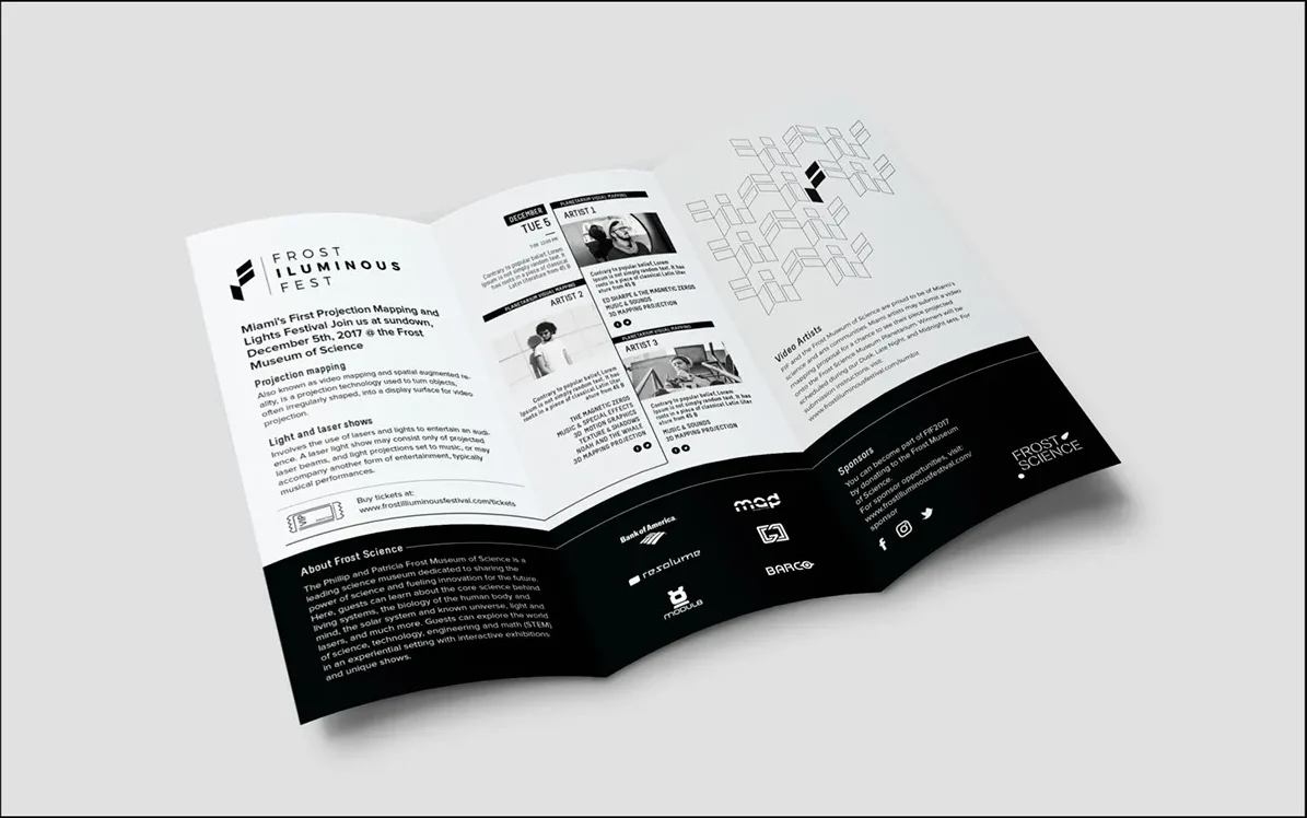
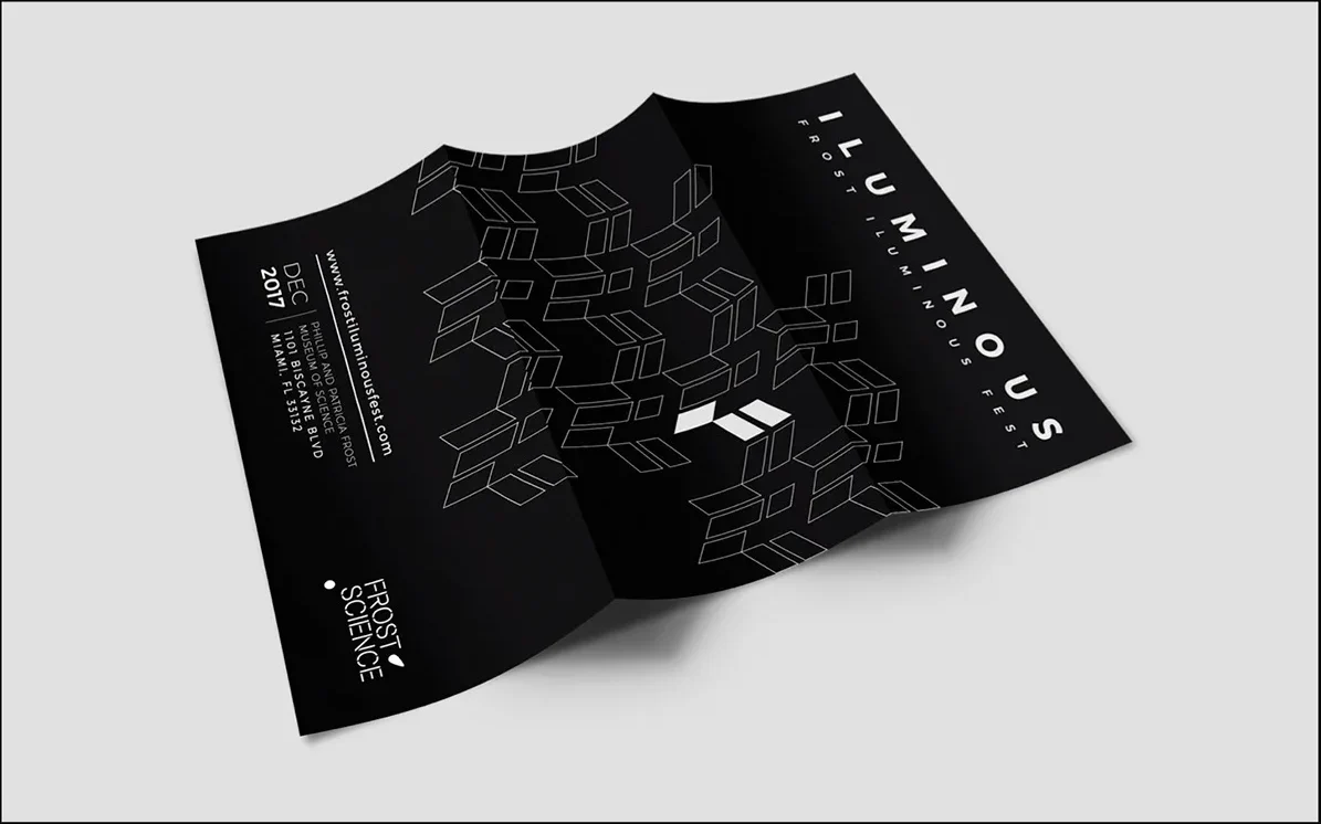
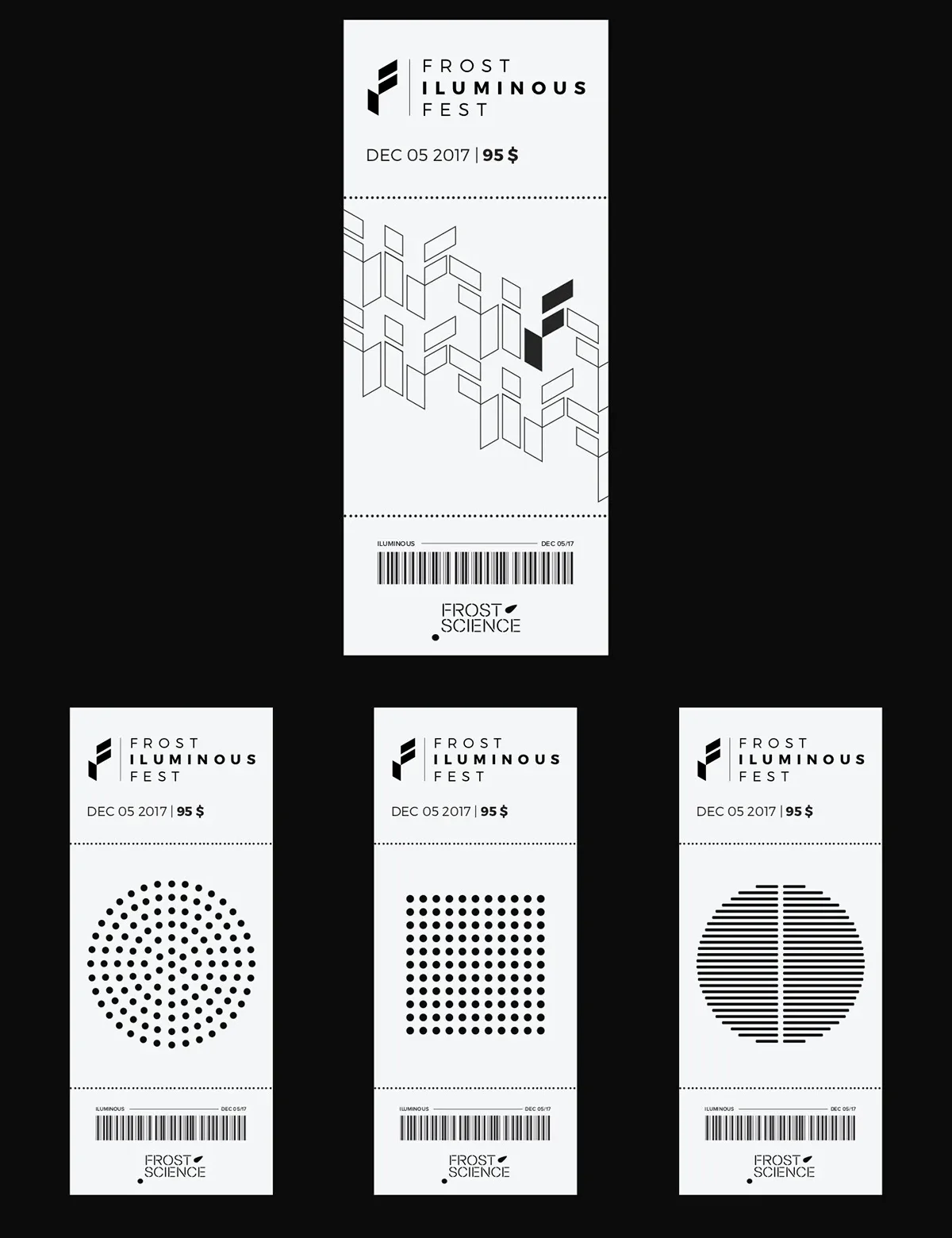
A printed program, tickets and flyers carry the event information. The grid and type hierarchy come straight from the posters, so the whole system feels like one piece.
Merchandise
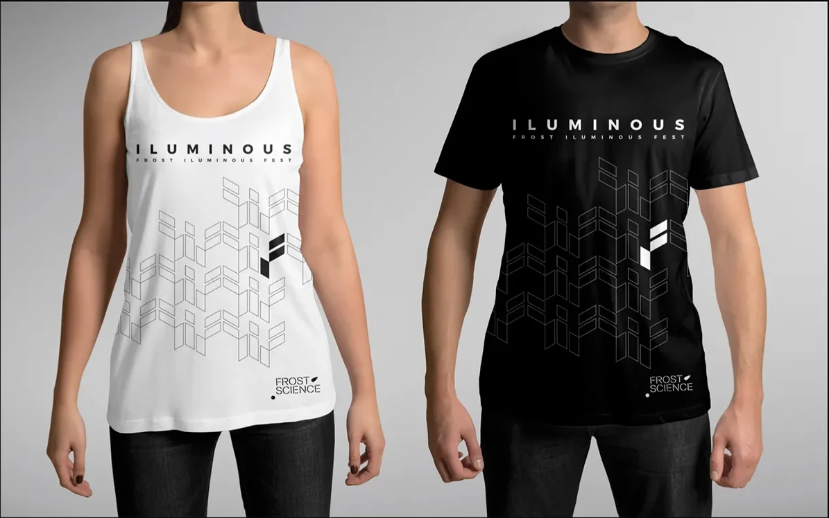
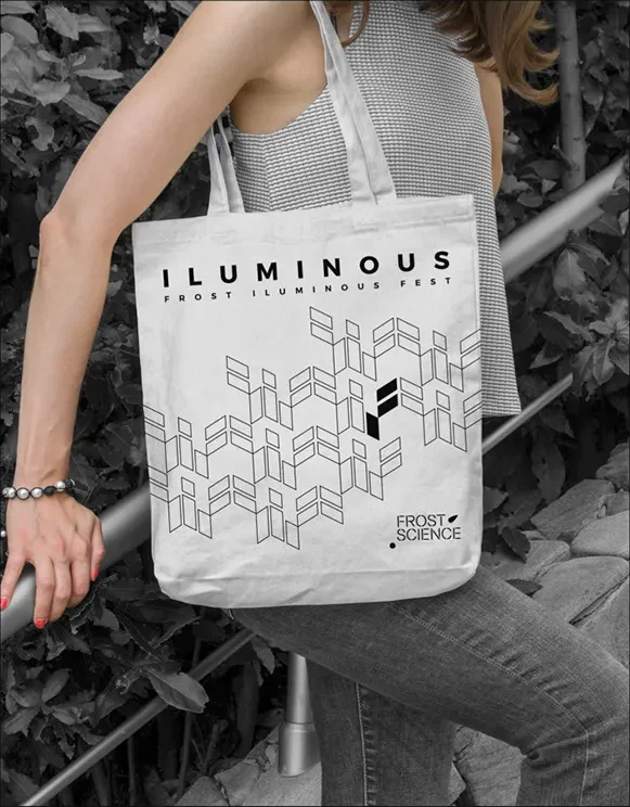
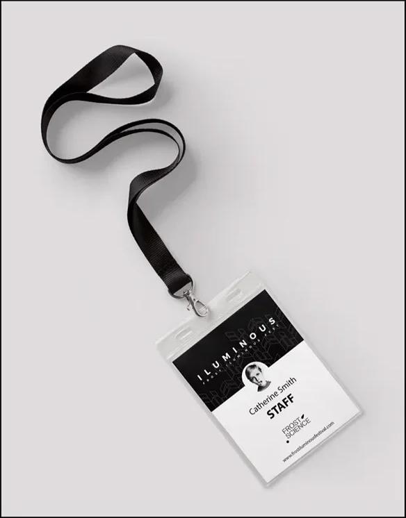
T-shirts, bags and accreditation take the symbol on its own, without the full wordmark: a quieter way to wear the festival after the night is over.
Web
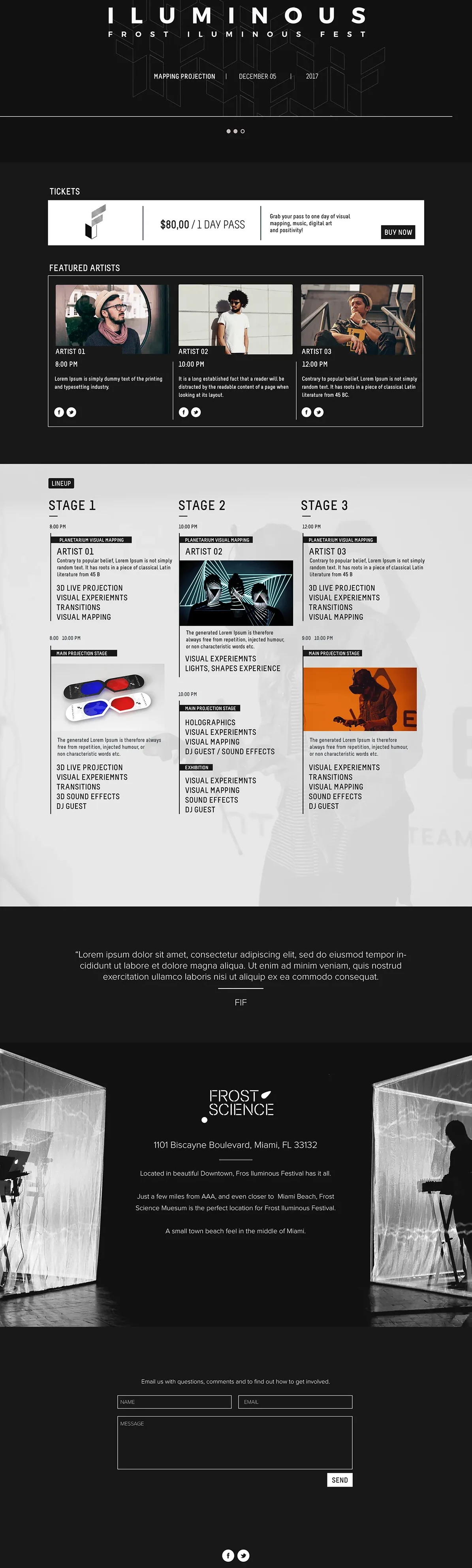
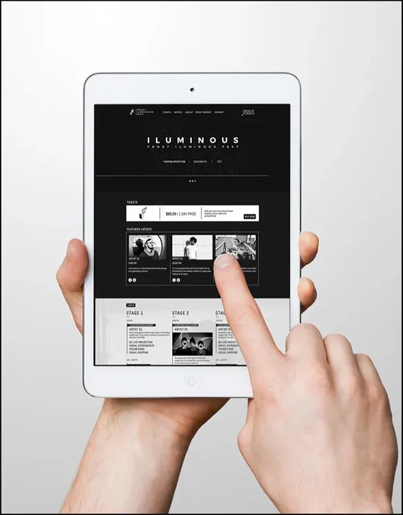
The website brings the schedule, line-up and tickets together in one long, dark page, built from the same grid as the print pieces.