Paleo Training
- ClientPaleo Training
- Year2023
- RoleLogo, icon family, brand system
- ToolsIllustrator · Photoshop
A training brand built on one idea: help people live healthier, happier and longer. Natural movement, real community, and an identity as strong as the workouts.
Identity
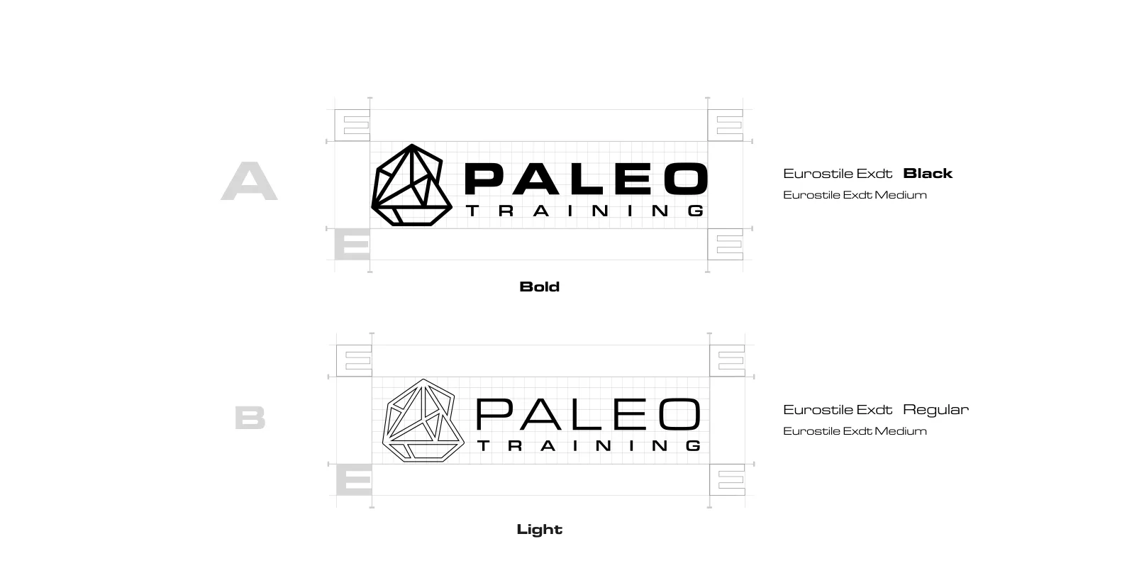
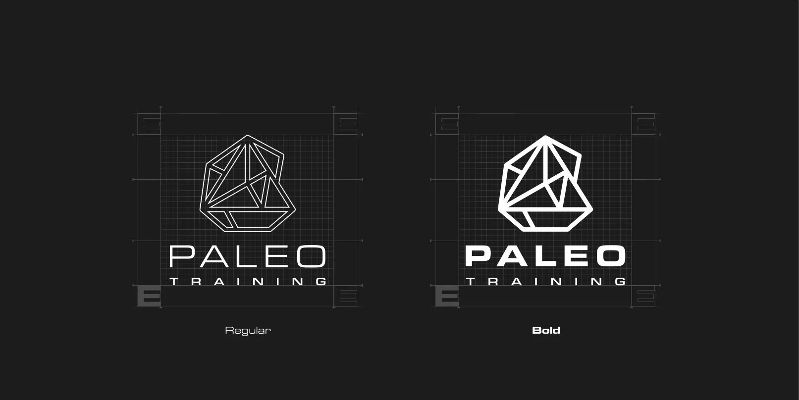
A faceted, stone-like mark inspired by the raw materials of natural training, paired with a wide, technical wordmark set in Eurostile Extended.
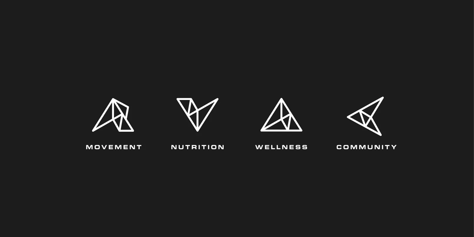
Four icons extend the system to the pillars of the brand: movement, nutrition, wellness and community.
Color
A warm palette taken from sun, earth and outdoor training. Golden yellow leads; charcoal and black keep it grounded.
Applications
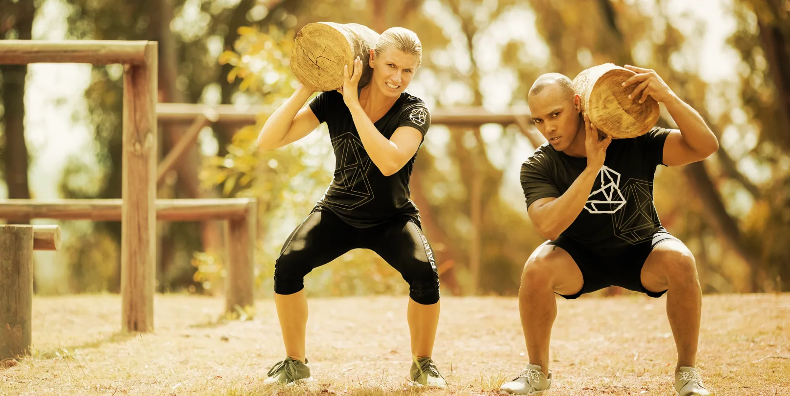
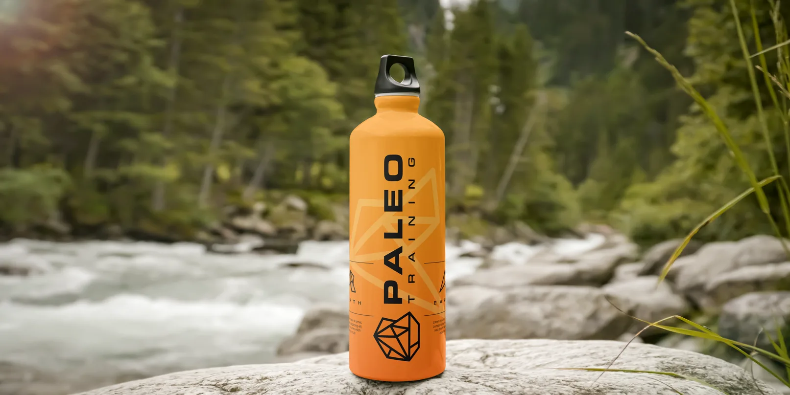
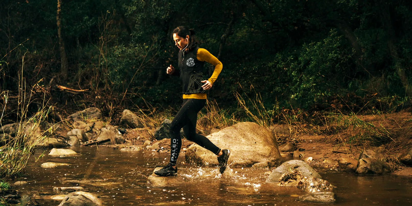
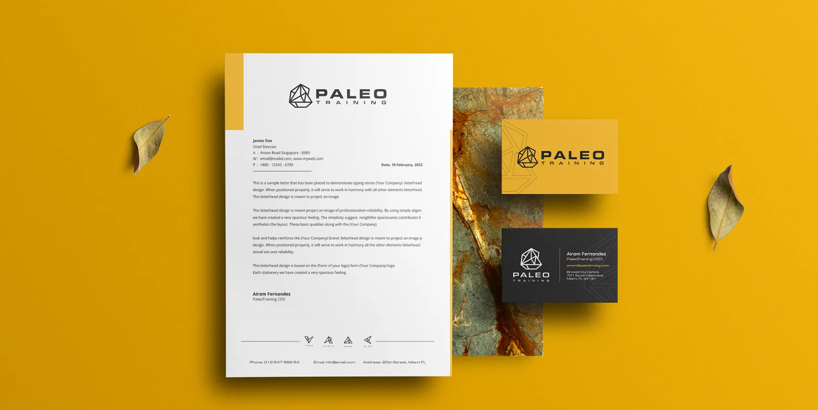
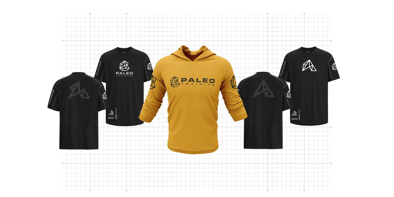
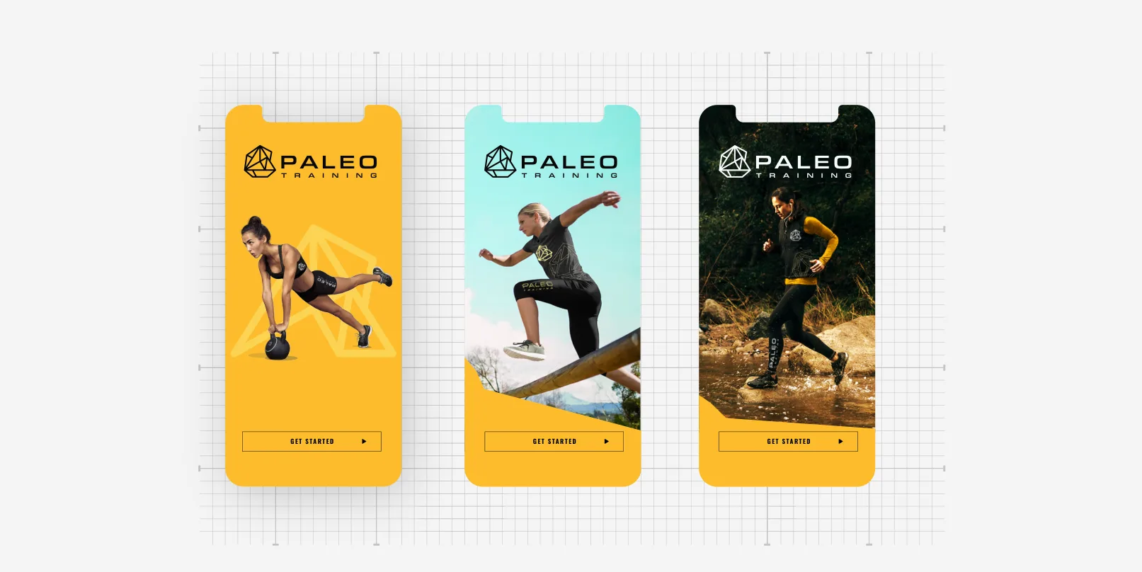
The system rolls out across stationery, training apparel, the app and gear, always with the same mark, palette and generous space.
Web
The website brings the brand online: coaches, training programs and community, with bold type over real training photography and the same black, gold and orange palette.

Look and feel
Photography stays outdoors and in motion: real people training in nature, with the brand present but never in the way.