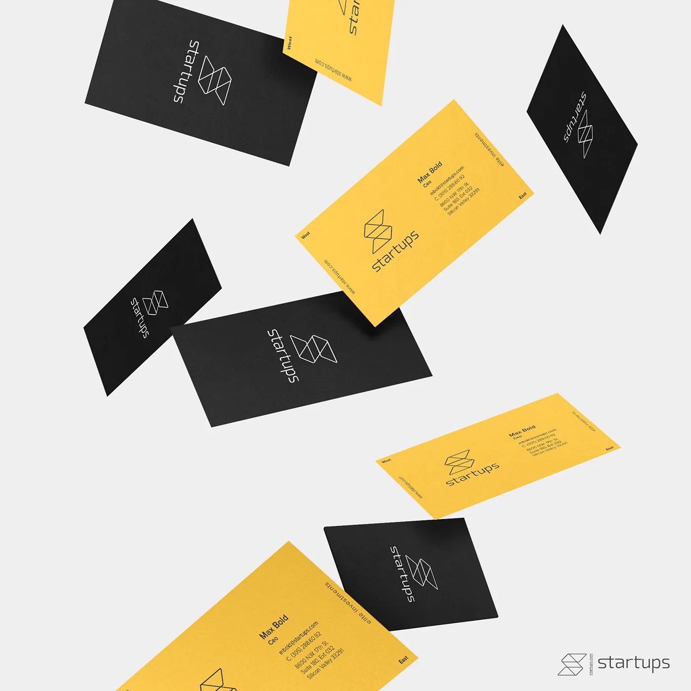
Startups
- ClientStartups
- Year2018
- RoleLogo, identity system, stationery
- ToolsIllustrator · Photoshop
A brand for a platform that helps new companies get off the ground. One mark, built to look as confident on a business card as on a phone screen.
Exploration
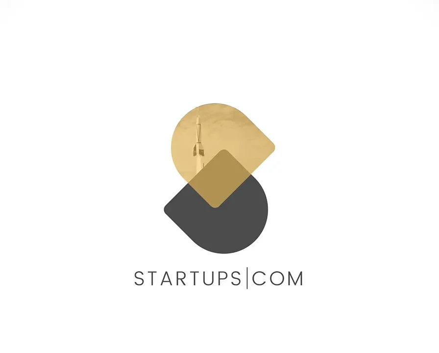
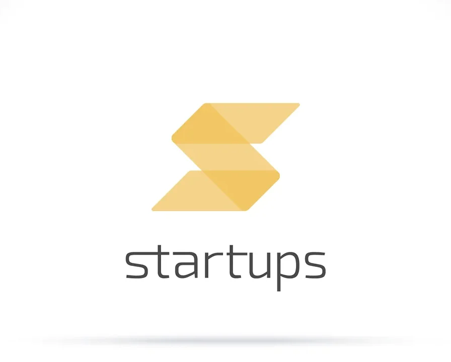
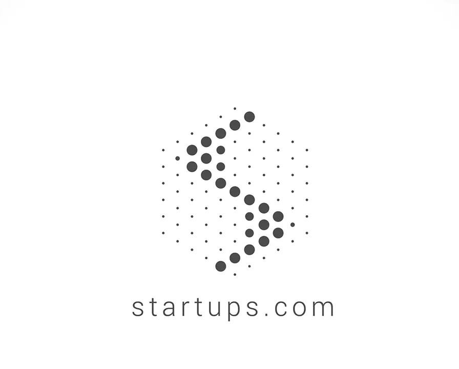
Before landing on the final mark, four directions were explored: a balanced circle split in two, a folded S, a dotted S made of single points, and a rocket that doubles as a pen nib.
Each one tested a different idea of what starting a company feels like: balance, momentum, building piece by piece, and launch.
The mark
The chosen direction is a modular S made of two folded planes, like two pages or two steps going up.
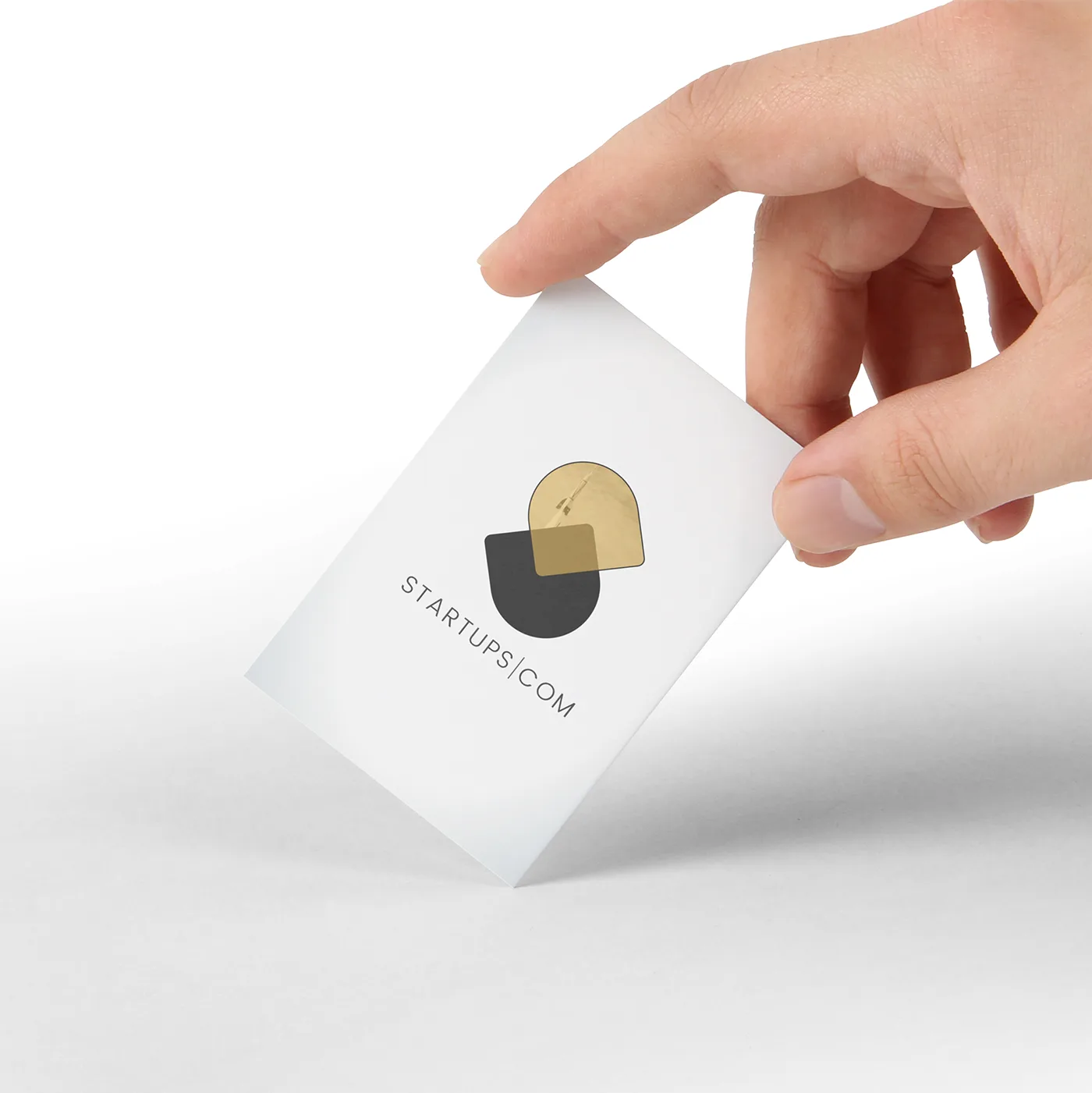
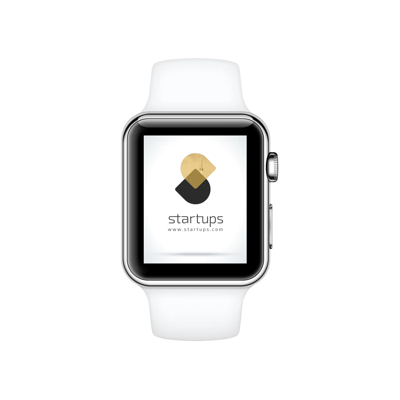
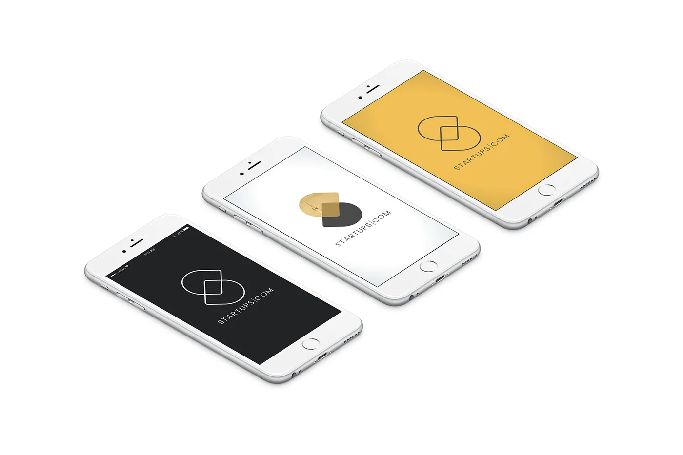
It works in a single color, scales down to an app icon, and holds up in both a warm yellow and a deep charcoal version.
Color
Yellow brings energy and optimism; charcoal brings seriousness and trust. Used together they give the brand two moods: bold for launches, calm for everyday communication.
System
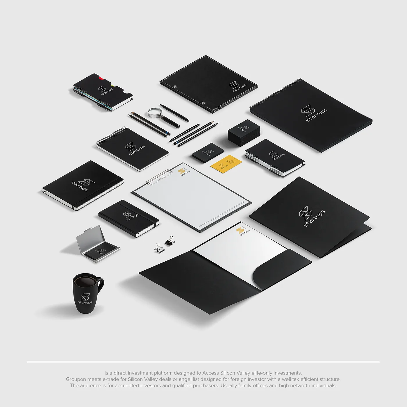
The identity rolls out across business cards, letterheads, envelopes, folders and digital screens.
A short list of rules (logo, two colors, generous white space) keeps every piece recognizable without feeling repetitive.